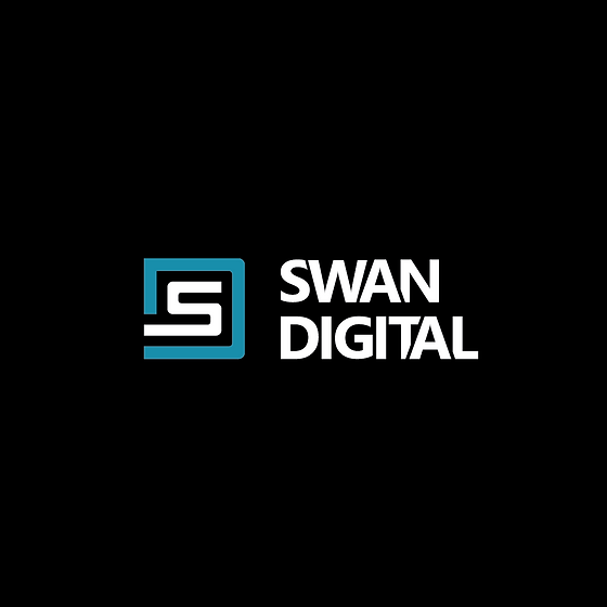
PROJECT | SWAN DIGITAL
BRAND & LOGO DESIGN
Modern. Bold. Digital-first.
Swan Digital was part of a broader rebrand project to separate two sides of a growing business, signage and digital services, into their unique brands. The goal for Swan Digital was to create a clean, confident identity that felt modern and tech-driven while still sitting comfortably alongside its signage counterpart.
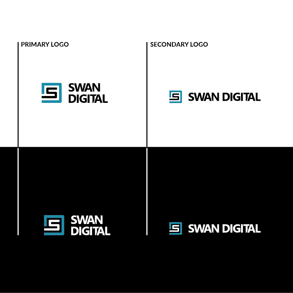
The Logo Design
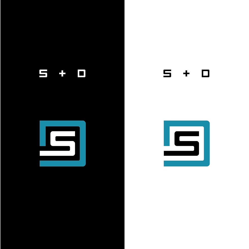
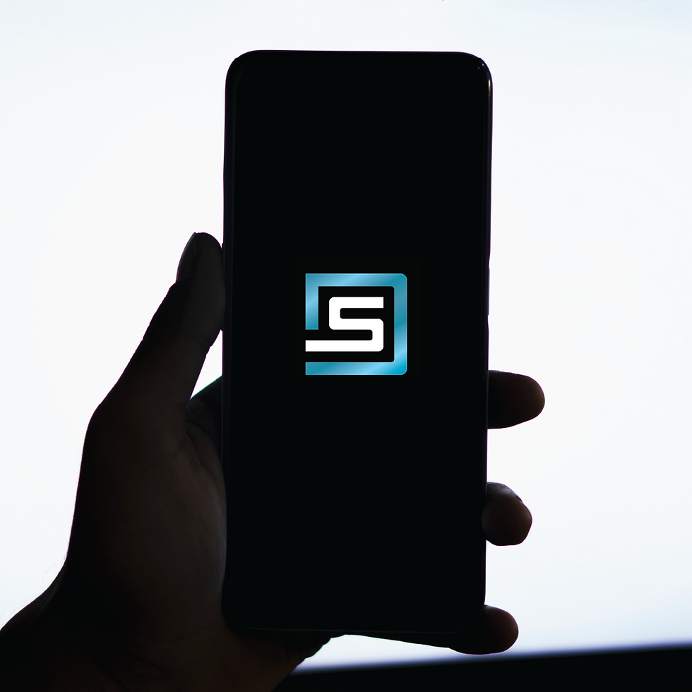
The logo uses simple, solid, and instantly readable typography across all screen sizes. To complement it, we created a small icon combining the S and D in a way that nods to digital elements like a screen or circuit board. It’s minimal and versatile, perfect for a brand that lives online.
The Strategy Behind the Look
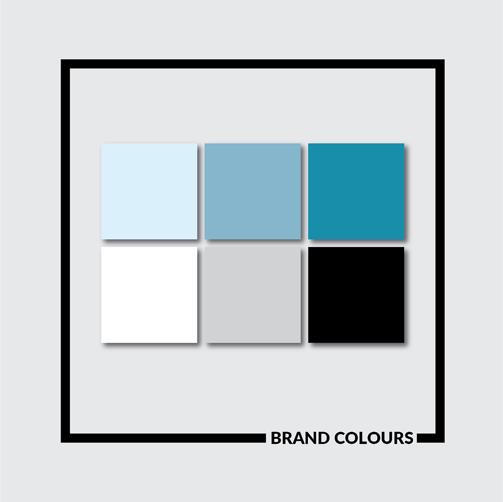
Swan Digital needed to stand on its own, with room to grow. At the same time, it needed not to feel completely disconnected from Swan Signage. So, we kept some subtle visual ties like colour and structure while giving it a distinct digital edge. The result is a brand that feels professional, future-ready, and built for the screen.