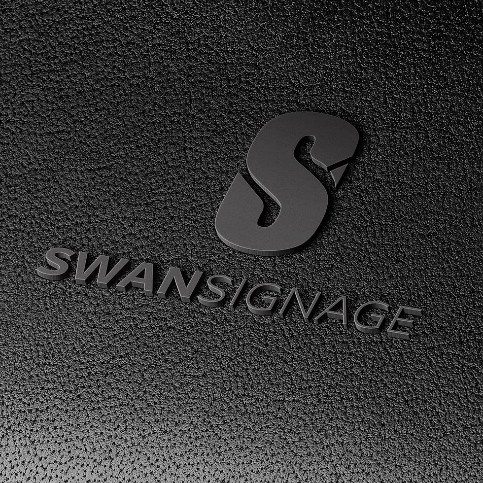
PROJECT | SWAN SIGNAGE
BRAND & LOGO DESIGN
Practical. Approachable. Brand-ready.
As part of a larger rebrand project, Swan Signage needed to evolve into its own stand-alone identity, distinct from its digital counterpart but still visually related. The brief was to create something simple, recognisable, and well-suited to rebranding existing vehicle decals, online presence, site signage and more.
The Logo Design
The ‘S’ in Swan was used as the foundation, a clean, confident letterform with a clever twist. With just a subtle curve and the addition of a small beak shape, the S becomes a swan. It’s a nod to the brand’s name without being overly decorative, and it holds up beautifully across different signage formats.
The Strategy Behind the Look
This brand needed to feel grounded and reliable, with just enough character to stand out. By simplifying the visual language and focusing on a smart, memorable logo, we created an identity that works in real-world applications, large scale, small scale, indoors, outdoors. And while it’s now its own brand, it still pairs seamlessly with Swan Digital through complementary design elements and colours.